UX DESIGN LEAD | 4 MONTHS
Simpler Trading
Who is Simpler Trading?
Simpler Trading is a financial education company that provides live trading tools and resources for individuals with different levels of experience interested in learning about the stock market.
So what’s the problem?
Simpler Trading is struggling to appeal to current users and garner new users for their current marketing website.
These users are can be described as:
Age Range: Elder Millenials – Gen X
User Values and Expectations:
- Expand financial literacy and seek opportunities in financial markets
- Motivated by financial success; value a platform that advances their trading journey
- Want easy access to tools featured in an intuitive design based on past experiences with other trading websites
- Wish to connect with like-minded individuals in a community
During user testing, users found the site confusing to navigate and unaligned with their expectations for visual design.

Final Design
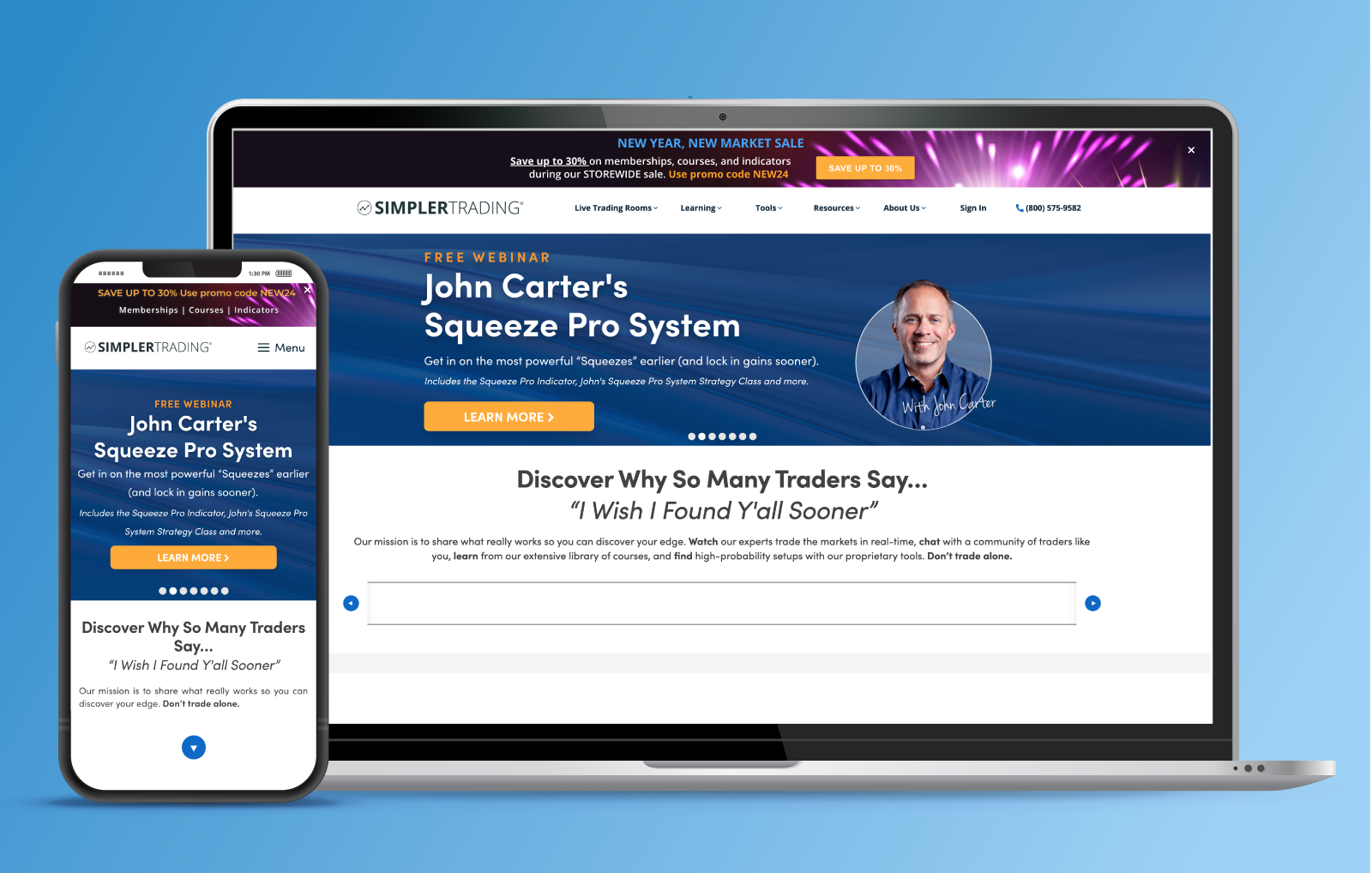
Initial Design
Where do I come in?
I was apart of a multi-disciplined team of visual designers and developers. I acted as the sole UI/UX designer. My team and I were tasked with creating a Minimum Viable Product (MVP).
I specifically built and maintained a templated component library and high-fidelity prototype to showcase an updated user interface.
I accomplished two major tasks:
I leveled-up the User Interface.
I employed a refined visual design to establish a design system, which was then implemented on a prototype to kickstart the development process.
I leveraged the software.
Using wireframing and prototyping software (Balsamiq/Figma) I connected the bridge to foster collaboration between the UI and Developer teammates.
What did I do to solve the problem?
The building process for the MVP involved a lot of creative problem-solving. Due to my agreement with the client, I am not allowed to share the entire prototype. I’ve highlighted 3 specific outcomes that I feel particularly proud of.
1. Site Map
2. Media Bundle
3. Parallax Scroll
Back To Top
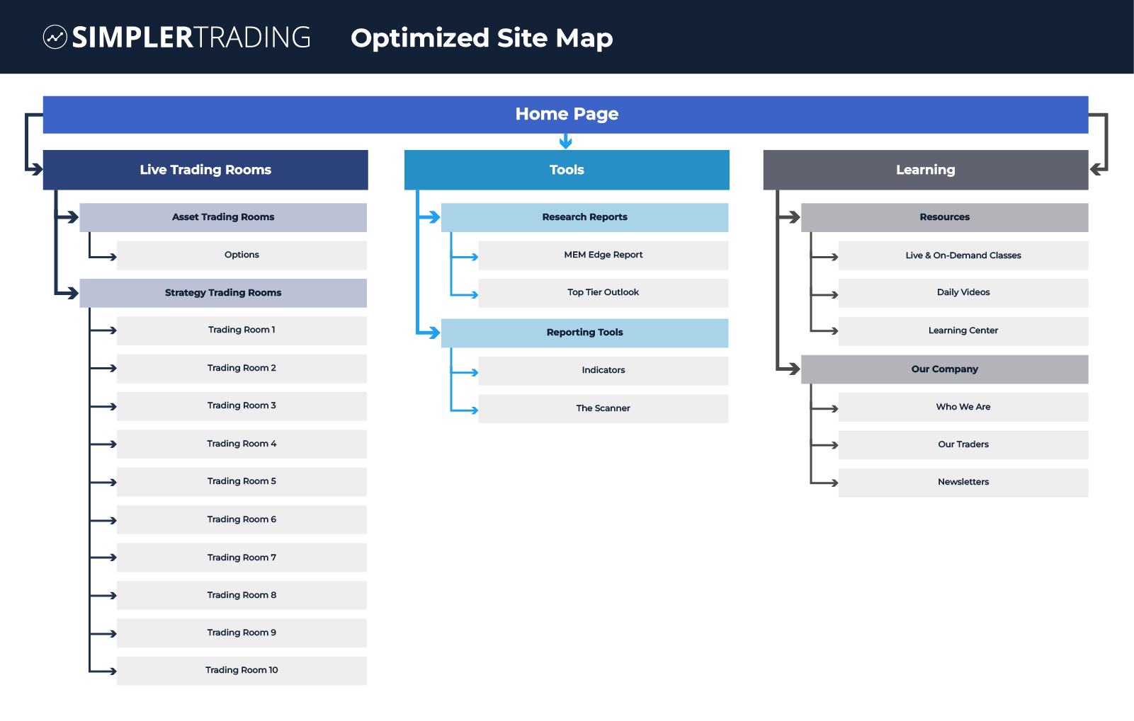
1. I optimized the site map.
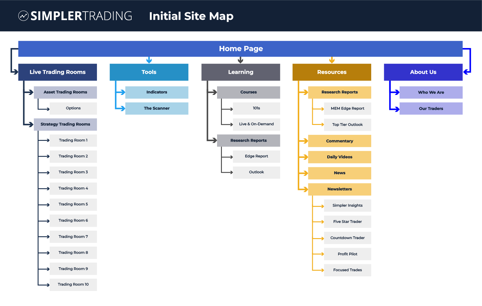
Flaws in the initial site map
During user-testing I noticed some painpoints:
-
Limited Content Presentation:
The Tools and About Us pages lacked significant content and did not meet user expectations -
Uneven Sub-Navigation Depth:
The inconsistency in sub-navigation depth confused users when searching amongst primary menu items. -
Lack of Visual Hierarchy:
The absence of a clear visual hierarchy negatively impacted user flow and site navigation.
Optimizing for ease of use
I reorganized similar content to align with the overarching goal of the site which now showcases content logically and appeals to users. I implemented subtle adjustments to the nomenclature of navigational items, resulting in a site map that improves navigation clarity and heightens user-understanding of the content.
2. I built a media bundle.

Scattered content
When I first analyzed the content, I noticed things weren’t displayed for an ideal user experience.
- User Confusion:
Similar content was spread out on the website, causing disruptions to user flows. - Content Overlooked:
During testing, users missed portions of content, leading to a lack in content comprehension. - Content Ineffective as a Marketing Tool:
Based on the lack of understanding the content, the site proved ineffective in garnering new users.
A hub for content
I named the solution a ‘media bundle’ as I crafted it to serve as a centralized place for displaying multimedia content. The feature empowers users to filter out content that might not resonate with them, while granting an understanding of the theme of the content.
I employed the user interface to aligning with users expectations, exemplified in the click interactions and animations.
https://isamontesdiaz.com/wp-content/uploads/2024/01/Media-Bundle.mp4
View Media Bundle Process
3. I implemented a Parallax Scroll feature.

Featuring all employees
The client had a specific ask. Is there any way to highlight each and every trader on the homepage in a logical way?
The solution also needed to account for:
- Adding future employees
- Taking out past employees
A highly interactive solution
A parallax scroll is a design technique that creates an illusion of depth on a webpage by moving elements at a different speed than the foreground as the user scrolls.
Implementing this technique was equally thrilling as it was time consuming. I was able to execute a dynamic and visually striking element to the employee photos and names. By utilizing 2 rows that bleed off the canvas of the website, the client can account for adding or subtracting employees as they please.
https://isamontesdiaz.com/wp-content/uploads/2024/01/Parallax-Scroll.mp4
View Parallax Scroll Process
What did I learn?
I attribute my success in this project to 3 key learnings:
A User-Centric Approach
It is incredibly important to make design choices based on user-testing and user needs; on this project and every project.
Iterative Design Process
Design choices can change and fluctuate based on many factors, like client asks and stakeholder decisions/objectives.
Working on the Fly
Being adaptable while working in a team is an asset. Keeping my cool and demonstrating a proactive approach to communication is and continues to be top of mind for me.